

A wallpaper can look beautiful in your photo library and become irritating the moment you use it. A pale moon sits behind the clock. A branch runs through the weather widget. The subject you liked gets pushed off the edge when the phone fills its screen. None of those problems is visible when you judge the image by itself.
Designing for that occupied screen changes the brief. You need room for information you already use, as well as a picture you enjoy. The useful test is simple: install a candidate, use your normal layout, and identify what competes with it. You can repeat the workflow on your own phone; the result needs to work with your clock, your widgets, and your chosen crop.
Step One: Map Occupied Areas Before Choosing Artwork
Start with the arrangement you actually keep. A lock screen with a large clock has different needs from a home screen covered in app folders. Look at the upper, middle, and lower parts separately. You are identifying occupied areas, not measuring a universal safe zone. Devices, settings, and personal layouts differ, so a composition borrowed from someone else’s screenshot may solve the wrong problem.
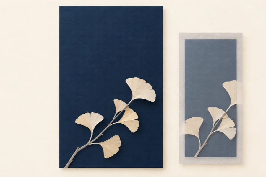
For a concrete example, imagine a dark blue wallpaper with a pale ginkgo branch. If the clock occupies the upper area, let that area remain mostly blue. Place the leaves lower down, with enough distance from the edge to survive a crop. The branch can still be expressive. Its job is to give the screen character without putting a bright leaf under every piece of information.
Kimg AI can generate images from written descriptions or work from an uploaded image. That makes it useful for exploring this composition before you settle on a background. Write down the intended quiet area first. You can then judge whether an attractive result meets your brief, instead of discovering afterward that the artwork needs an entirely different arrangement.
Step Two: Describe Empty Space Before Decorative Detail
A prompt for this job should describe where the interest belongs. Consider: a single pale ginkgo branch entering from the lower right, against a deep blue background, with a broad uninterrupted area above it. That is more actionable than asking for an elegant phone wallpaper with beautiful detail. It names a subject, a location, and the space that must remain usable.
When exploring Banana AI, keep the first request focused on that arrangement. Extra requests for glowing particles, dramatic clouds, or intricate texture introduce things you will later have to remove. You can add one visual quality after the composition works. A restrained starting point also makes a failed result easier to explain: either the branch is misplaced or the supposed quiet area is too busy.
If you already have an image you like, Kimg AI accepts an image as the starting material for a described transformation. Ask for the change that matters, such as simplifying the upper background while retaining the general branch arrangement. Treat the result as a new candidate. An edit request does not establish that every leaf or edge will remain identical, so compare it with the source before choosing it.
Keep your original file alongside the variations. A later version can improve the empty space while weakening the feature you liked, and memory is a poor substitute for looking at both. Compare the overall branch shape before you inspect small textures. If you need the exact original drawing preserved, use an ordinary editor for the crop or placement instead of expecting a fresh generation to behave like a locked layer.
Step Three: Install the Image and Diagnose Interference
One useful way to compare two candidates is to give both the same crop before judging their appearance. Otherwise, a more generous crop can make a weaker composition seem successful. If your phone automatically enlarges one image to fill the screen, notice what has been removed. The missing space may explain the difference more clearly than any change in the artwork itself. Keep the comparison small enough that you remember why each variation exists.
Now leave the generator and put the candidate into your phone’s wallpaper preview. This is a device check, not a feature of the image service. Use the crop and positioning controls your phone provides, then inspect the same layout you mapped earlier. Do not approve the picture simply because it fills the display. Look for the part that becomes harder to read or recognize.
There are several possible outcomes. A branch tip disappearing at the edge is a framing problem. Bright texture running behind the clock is a composition problem. Fine leaf veins vanishing at ordinary viewing distance may not be a problem at all. Keeping those diagnoses separate prevents you from asking for more detail when the useful correction is actually less detail in one particular place.
A second Nano Banana variation is worth making when you can name the obstruction. Move the pale cluster lower, reduce contrast in the upper background, or simplify the small shapes beside a widget. Change one aspect at a time so you can tell whether the revision helped. If the upper area becomes quieter but the branch now crowds the bottom shortcut, the revision has moved the problem rather than resolved it.
Color changes deserve a separate look. Making the whole background darker can calm a bright patch, but it can also hide the branch. Try reducing the distraction locally in the description before changing the overall mood. If that repeatedly damages the subject, return to the simpler candidate. You do not have to salvage every promising variation, especially when the original arrangement was already readable.
Check the screen at the brightness you normally use in the room where you use it most. Then try the other screen state you care about. A background that works behind a lock-screen clock may be distracting under a dense home-screen layout. You may prefer separate versions. There is no need to force one image to solve two different arrangements just because both versions began with the same branch.
Kimg AI is useful here as a source of visual alternatives, while the installed screen supplies the acceptance test. Keep a short note beside each candidate: clock readable, branch cropped, or background too busy. That small amount of specificity is enough. A broad rating such as eight out of ten hides the reason you would choose one image over another.
Keep the Wallpaper That Works Without Further Rearranging
Choose the candidate you can leave in place with your existing layout. If you have to move every widget to rescue the image, reconsider whether the picture fits your phone use. Kimg AI suits someone who wants to explore a personal composition and is willing to inspect the output. A simple crop in a conventional editor is the better choice when the original artwork already works and only its framing needs adjustment.
You have finished when the image remains enjoyable and the screen stays easy to use. Keep the original and the chosen variation, then stop generating. The version with the most detail has no special claim to being the one you should see every time you unlock your phone.