

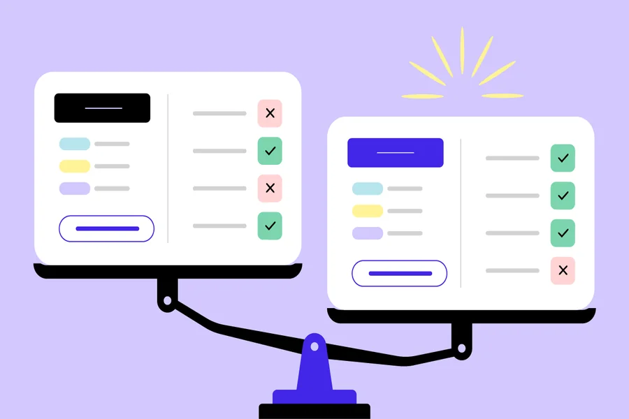
Two products can receive similar ratings and produce completely different results for the same company. One fits naturally into the way employees already work. The other technically performs every required task but makes people fight through menus, exports, and extra steps.
That is the weakness in many software comparisons. They focus on capability when the more useful question is how the product behaves during ordinary work.
The difference becomes obvious in everything from field time tracking to presentation software.
Field teams need more than a digital clock
Time tracking sounds simple until employees stop working at desks.
A technician may start at the warehouse, drive to three customer locations, take a lunch break, and finish the afternoon somewhere with poor mobile reception. Managers need accurate hours, but they may also need to understand which customer or project received that labor.
This is where TSheets reviews can be useful, particularly when they describe actual field use rather than repeat a feature list. TSheets became QuickBooks Time, so current buyers should also account for that change when researching the product.
Look for comments about clocking in from phones, correcting timesheets, assigning time to jobs, managing crews, and moving approved hours into payroll or accounting processes.
A landscaping company with 40 mobile workers should give much more weight to those experiences than to feedback from a three-person office.
Reviews become valuable when patterns appear
One complaint rarely proves much.
An employee might dislike a mobile interface because they received little training. A manager could criticize reporting because they selected the wrong plan or configured the product poorly.
Patterns deserve more attention.
If multiple TSheets reviews describe the same difficulty around time edits, mobile use, support, or administration, add that issue to your trial checklist. Then recreate it yourself.
Have a field worker clock into the wrong job and correct the mistake. Ask a supervisor to review a week containing overtime and several projects. Run the information through the process your payroll team actually follows.
A review should give you something to test, not make the purchasing decision for you.
Presentation software depends heavily on where the file goes next
The Keynote vs Powerpoint comparison looks simple until several people need to touch the same deck.
Keynote is attractive for teams working heavily within Apple’s ecosystem and can be a comfortable environment for creating visually polished presentations. PowerPoint remains deeply familiar across many business environments and fits naturally with Microsoft 365 workflows.
Neither advantage matters much if it conflicts with how your organization exchanges files.
Imagine an agency creates a client presentation on a Mac. The client then sends the deck to six employees who need to edit it on their company laptops. Fonts, animations, charts, and layouts suddenly matter more than whichever application the original designer preferred.
The destination of the file should influence the tool used to create it.
Compatibility deserves a real test
Do not test presentation software by making five attractive slides and presenting them from the same laptop.
Move the file.
A useful Keynote vs Powerpoint trial could include a 30-slide company presentation containing charts, custom fonts, images, speaker notes, embedded media, and several people making edits. Export it into the required format and open it on the machines colleagues or clients actually use.
Then inspect every important slide.
Minor formatting changes may be acceptable for an internal presentation. They become much more irritating when a sales employee opens a deck five minutes before a client meeting and discovers that text has moved across a chart.
Compatibility problems tend to appear at inconvenient times.
Compare the annoying tasks
Product demonstrations naturally concentrate on the best parts of software. Buyers should spend more time testing the boring parts.
For time tracking, correct an employee’s missed clock-out. Reassign hours. Approve a timesheet containing an error. Find last month’s record.
For presentation software, change the company logo across an existing deck. Replace a font. Send the presentation to somebody else for edits. Export it and check whether anything moved.
These mundane actions are repeated far more often than flashy demonstration features.
They also reveal how much work the software quietly gives back to employees.
The winner can change from one team to another
There is rarely a useful universal winner in a head-to-head software comparison.
A contractor with dozens of mobile workers has different time-tracking requirements from a design agency. A company where everyone works on Macs can make a different presentation choice from an organization that exchanges editable decks with hundreds of Microsoft-based clients.
Context decides which tradeoffs matter.
That is why the strongest comparisons begin with a real Tuesday afternoon: the employee who forgot to clock out, the manager approving payroll, the analyst editing slides, or the salesperson opening a client deck on an unfamiliar laptop. Software earns its place when those ordinary moments become easier, because those are the moments people will actually repeat.